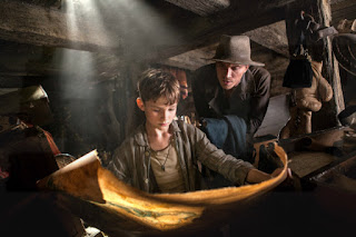
This is where things get ugly. And they certainly shouldn't - one glance at director Joe Wright's previous films and anyone would conclude that he's incapable of making an ugly film. It's not for want of effort, since Pan is a heavily designed film full of colour and light, only that it's so full of colour and light as to be suffocating in its visual schematics. Wright knows how to construct a memorable image, and how space and location can inform the mental and emotional impacts of a shot or a scene; would that Jason Fuchs' screenplay were as thoughtful. It follows a familiar narrative path with a familiar attitude toward character and dialogue, developing its set story with a sense of resignation to its inevitability. True, it's pretty obvious where Pan is destined to wind up, more so with each and every new development, but it ought not to be so obvious how disappointing that path to its conclusion must be. Wright's resignation to the screenplay is understandable - he's never been the most literate of filmmakers - but the sheer unattractiveness of his own approach is most unlike him; he seems to have sacrificed quality for quantity, simply filling the screen with razzle dazzle in the hope of creating the most sparkling 3D blockbuster experience. Uglier still is the soundtrack from John Powell, a heavy-handed attempt at resembling John Williams, blighted by the unfortunate decision to incorporate contemporary rock songs in the most cringeworthy way conceivable. Even uglier again is Pan's attitude toward race, apparent in its dismissal of a multi-racial ensemble of extras and its elevation of its white characters, not to mention the well-documented race reversal of key roles in a missed opportunity to correct the crassness of J. M. Barrie's text.


No comments:
Post a Comment